'Flattening the curve' - why is it important for coronavirus?

With the emergence of the novel coronavirus and the propagation of the infectious disease COVID-19 around the world, everyone is talking about 'flattening the curve.' But what does this mean, and why is it so important?
Preventing a sharp peak of infections, known as flattening the epidemic curve, helps avoid healthcare services being overwhelmed, and also provides more time for a vaccine/treatment to be developed. The same number of infections spread over a longer time frame allows healthcare services to better manage the volume of patients. Siouxsie Wiles and Toby Morris - https://thespinoff.co.nz/society/09-03-2020/the-three-phases-of-covid-19-and-how-we-can-make-it-manageable/
The concept
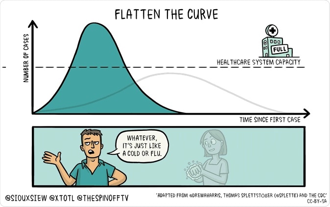
The term 'flattening the curve' comes from a chart depicting two curves that demonstrates the outcome of social distancing. The key message of the chart is that it is essential to delay the spread of the virus from person to person, even if it is an impossible task to halt the spread.
Social distancing is a term applied to specific non-pharmaceutical infection control actions taken by public health officials to stop or slow down the spread of a highly contagious disease.
The objective of social distancing is to reduce the probability of contact between persons carrying an infection, and others who are not infected, to minimize disease transmission, morbidity, and ultimately, mortality.
Experts estimate that anywhere from 20% to 60% of the world's adult population could catch coronavirus disease or COVID-19. This means 40 million cases, at a conservative estimate, in the US alone! Considering that there is no vaccine or specific drugs for this disease, this might make you feel hopeless. However, this is not what healthcare professionals are saying. They want everyone to cooperate in 'flattening the curve.'
The curve simply stands for the number of people who catch the virus and develop COVID-19, the disease. The first curve is a sharp, steeply rising one, while the second is a smooth low curve. The first shoots up to peak well above a dotted line representing healthcare system capacity, or the number of cases the healthcare system is equipped to undertake. The second peaks below this line.
The message is clear, and experts now recognize the innovative graphic as the key to containing the mortality rate of this pandemic. It also answers a lot of questions as to the formulation of plans intended to contain the virus. The chart is deservedly acclaimed as providing a concise and understandable summary of the importance of personal precautions to be taken by individuals, apart from government measures.
The importance
Why is this the key? As the chart shows, slowing the spread of the virus means that it affects fewer people at a time, to ensure that the caseload doesn't become too heavy to be dealt with by the limited health resources available to handle it. On the other hand, if there is a flood of new cases and the virus is spreading too rapidly, the healthcare system will be swamped, leading to delays in diagnosis, missed cases, and unnecessary deaths.
It also provides an answer to the dubious premise that intervention is unnecessary and that the virus should be allowed to progress through the global community at its natural speed of transmission. Some individuals think this would hasten the pace with which the pandemic runs its course. The pitfall is that this kind of thinking could turn the curve of coronavirus incidence (new cases) into a steep spike, making it potentially impossible to look after all the patients properly.
Thus, the answer to whether it is more important to stop transmission or to limit transmission at any given time is that the former is more essential. The point is that by reducing the number of people with the disease at any given point, the total duration of the pandemic and the number of new cases may go up. Still, the disease burden at any point in time will be manageable.
The graph was posted online by a population health analyst called Drew Harrison, but he did not create it. That was done by a journalist, Rosamund Pearce, who, in turn, adapted a chart she saw in a paper published by the Centers for Disease Control and Prevention (CDC). Harris's contribution was a simple dotted line indicating the level or number of cases at which healthcare providers could no longer cope with the disease – which means they can no longer treat the disease properly.
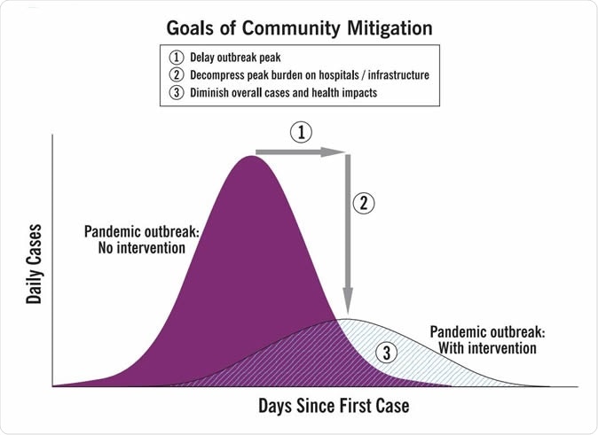
Image Credit: CDC
After all, the supply of doctors, nurses, and paramedical staff is not infinite. The amount of care and time they can give is limited. And if they fall prey to the virus, they will be isolated as well, which means their services are lost. The hospital beds can be summed up to a finite number, as can the number of intensive care unit beds and paraphernalia available in any country. And finally, the emergence of coronavirus doesn't mean that other illnesses like heart attacks, stroke, and cancers become any less prevalent. The only answer is to keep virus-affected people out of hospital as long as possible by taking necessary precautions to stagger its spread.
The chart thus made it easy to understand how important it was to keep the curve smooth rather than allow it to spike up. Harris explains the idea behind the chart: "The ideal goal in fighting an epidemic or pandemic is to halt the spread completely. But merely slowing it – mitigation – is critical. This reduces the number of cases that are active at any given time, which in turn gives doctors, hospitals, police, schools and vaccine-manufacturers time to prepare and respond, without becoming overwhelmed. Most hospitals can function with a 10 percent reduction in staff, but not with half their people out at once."
The chart has received the ultimate compliment of being copied and adapted in numerous ways, all the versions having been received enthusiastically. One particularly widespread clone of the chart spread an important health truth: the difference between a more spread out and less dangerous outbreak and a sharp uncontrollable increase in cases could be, in part, due to the failure of people to comply with basic health measures such as handwashing, catching sneezes and coughs in tissues which are then safely disposed of, and avoiding social gatherings – in short, just plain staying home. Though many people neglect these steps, thinking they are not going to keep the virus away forever, they are missing the point – postponing the moment when it reaches you, if ever, is almost as useful as preventing its spread altogether.
The message
Current official pandemic management includes flattening the curve, beginning with China, where the government started locking down whole cities once it became clear that the virus was spreading out of control. Though the policy was harsh and undoubtedly caused much suffering, it did mitigate the spread of the virus. It bought time for the health system to build up resources so it could treat infected individuals properly.
Now public health officials have passed out the message, and event organizers, universities, and even workplaces have followed suit all over the world, canceling all mass gatherings. Now, the onus for interrupting the spread of the virus has shifted from the government to every single citizen – follow the advice you're getting from the experts.
Sources:
- Interim Pre-Pandemic Planning Guidance: Community Strategy for Pandemic Influenza Mitigation in the United States—Early, Targeted, Layered Use of Nonpharmaceutical Interventions, CDC, Feb 2007 - https://www.cdc.gov/flu/pandemic-resources/pdf/community_mitigation-sm.pdf
- Griffin, A. ()2020). How to stop coronavirus: Why 'flattening the curve' could be key to fighting Covid-19. https://www.independent.co.uk/news/science/coronavirus-flattening-the-curve-covid-19-vaccine-explained-healthcare-response-a9395441.html
- Boboltz, S. (2020). Here's why everybody's talking about 'flattening the curve'. https://www.huffingtonpost.in/entry/flatten-the-curve-coronavirus_n_5e67d697c5b68d61645bef02?ri18n=true
- Theconversation.com. (2020). Coronavirus control measures aren't pointless – just slowing down the pandemic could save millions of lives. https://theconversation.com/coronavirus-control-measures-arent-pointless-just-slowing-down-the-pandemic-could-save-millions-of-lives-133468
- Social distancing - https://en.wikipedia.org/wiki/Social_distancing
- Flu Pandemic Study Supports Social Distancing - https://www.nih.gov/news-events/nih-research-matters/flu-pandemic-study-supports-social-distancing


.png)


No hay comentarios:
Publicar un comentario